Copy and paste into Codex, Claude Code, Cursor, or any coding agent with terminal access to install Frame in the current project.
Agent Plugin candidate: Design and audit reliable conversational and agentic AI products—from chat and voice to tool use, citations, confirmations, failure and recovery, and human-in-the-loop control—using Frame principles, released components, implementation rules, and verifiable checks. Privacy · Support
Built for: Designers, developers, and product teams creating reliable conversational and agentic AI products.
Operating Model
One system, shared across products. Use this guide to find the right source, see how each product uses the system, and understand how design work is checked before release.
One source, many consumers
Frame Design System
Shared across products
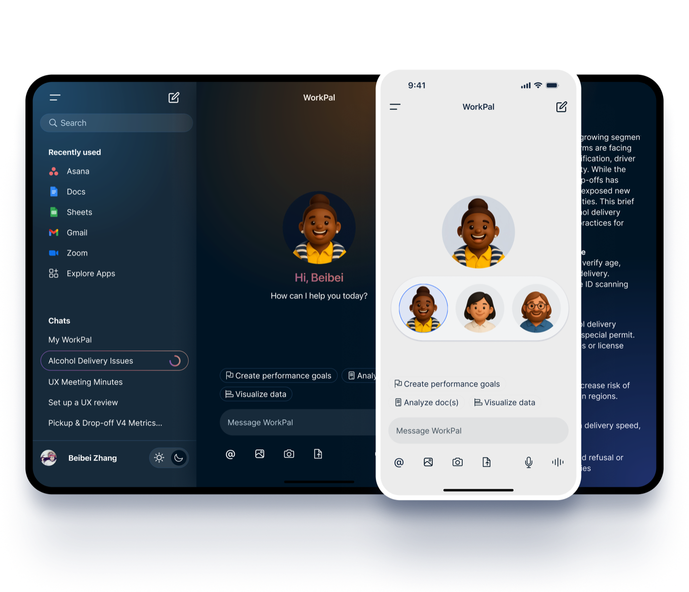
WorkPal (Workspace)
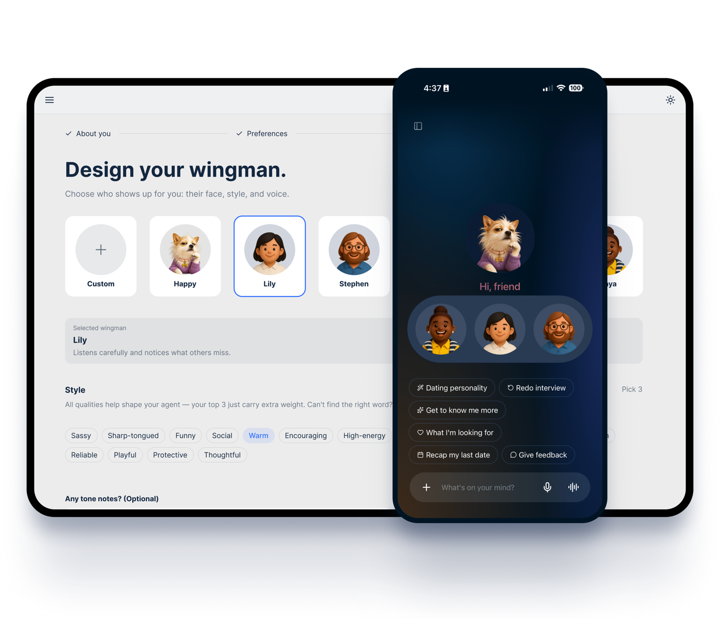
Wingman (Dating Space)
What the design system and products each own
Shared design system
Design principles and shared documentation content
Color, typography, spacing, radius, motion, and theme tokens
Reusable primitives, promoted patterns, and their shared variants
The company catalog examples that explain those shared definitions
Product code
WorkPal and Wingman directly use the shared components, layouts, and variants provided by packages/design-system; each product configures which ones to use and how they appear, then connects its own features, data, routing, and business logic.
How Codex and Claude Code execute design work
Read the project-level AGENTS.md or CLAUDE.md, then the repository design guidance and applicable product specification.
Check the Component Library first and reuse a shared component wherever possible.
If nothing fits, register and showcase the new shared primitive in the package and company catalog. For WorkPal-originated gaps, also add it to WorkPal's Review Queue for approval.
Run design-lint, relevant tests, and builds; visually verify the affected page, responsive states, and both themes when applicable.
Automated assurance
The assurance model has three layers. Each catches a different kind of risk, from code-level rules to the final page.
Layer 1 — Static rules
Active today. design-lint enforces selected hard rules on new UI changes: token and typography discipline, no emoji in product UI, and touch-target risk warnings. Build validation confirms affected applications compile.
Layer 2 — Component and accessibility contracts
Product-level coverage is active today: tests already verify shared component behavior and accessibility in the applications that use them. Next, this coverage will be consolidated into a consistent design-system contract layer.
Layer 3 — Visual regression
Planned. Repeatable screenshot comparisons will protect stable pages across themes, states, and responsive layouts from unintended visual change.
Public AI implementation resources
Use the public guide and rules to implement with Frame. They support alignment but do not certify design quality, accessibility, correct behavior, or complete compliance; human review remains necessary.
These 13 principles guide every UI design decision made by designers and Coding Agents, with DESIGN_SYSTEM.md §3 as the single source of truth. Five also map to mandatory implementation rules in the repository-root AGENTS.md, with the corresponding rule number shown on each principle.
The 11 hard implementation rules live separately in the repository-root AGENTS.md §2; the two sets complement each other, and overlapping entries cross-reference both ways. Principle #7’s “13 text styles” counts typography tiers — a coincidence, not these 13 principles.
1
Shared-first
Build reusable UI in packages/design-system/src/shared.tsx, then import into pages. Never copy component code inline. Implementation rule: AGENTS.md §2 #5.
Why: One source of truth means token changes propagate everywhere automatically.
Use CSS variables and utility classes for every color, size, and spacing. Never hardcode hex, px font sizes, or arbitrary spacing values. Implementation rule: AGENTS.md §2 #1.
Why: Tokens are the only way light/dark mode and future rebrands stay coherent.
Use PrimaryButton (gradient CTA) at most once per view. Multiple gradient CTAs dilute the focal point.
Why: The gradient is a visual anchor — duplicating it creates ambiguity about the primary action.
4
1–2% gradient budget
The brand gradient (#7652B9 → #B46470 → #CA9D8C) is reserved for the single focal element per view: the primary CTA, a hover affordance, or a hero title.
Why: Gradient saturation breaks the hierarchy and reads as decorative rather than meaningful.
5
Callouts are blue, not gradient
Use --color-accent-blue (#3171FF) for selected chips, links, progress, and focus rings. Never substitute the brand gradient for these signals.
6
StatusTag success green is unique
The success tokens (--color-accent-green / --color-accent-green-bg) appear only inside StatusTag variant="success". Do not repurpose them for other UI.
Why: Reserving the color keeps "success" visually unambiguous across the product.
7
13 text styles only
Use .type-display-xl, .type-display, .type-h1, .type-h1--emphasized, .type-body, .type-body-emphasized, .type-h2, .type-h2-emphasized, .type-h3, .type-detail, .type-detail-emphasized, .type-caption, .type-footnote. Never use raw px sizes or Tailwind’s native type/weight scale (text-sm, text-base, font-bold, font-medium …). Forbidden running-text sizes: 9, 10, 13, 17, 18, 24, 28, 32 px. 11/12 are valid only via .type-footnote / .type-caption. ("13" here counts the text-style tiers — it is a coincidence that there are also 13 principles.) Implementation rule: AGENTS.md §2 #2.
All icons come from lucide-react. No emoji in product UI. Never render letters or abbreviations as icon stand-ins. Never import another icon library or inline SVG. Implementation rule: AGENTS.md §2 #6.
All colors must come from CSS variables bound to :root / .dark. Monochrome PNG assets use .icon-theme for auto-inversion. Lucide SVGs inherit currentColor.
10
Three-panel shell
Every feature is a slot inside NavPanel, ConversationPanel, or InspectorPanel. Do not introduce new top-level chrome.
If an existing shared component cannot satisfy a need, build the new one in packages/design-system/src/shared.tsx and add it to the company viewer catalog. When the candidate originates in WorkPal, also register its promotion status in WorkPal's Review Queue tab. Approved components stay in shared.tsx; rejected ones revert to the closest existing primitive.
12
Bg fill or border, not both
A card / panel uses EITHER a background fill (bg-bg-hover, bg-bg-page, bg-card, etc.) OR a border (border-stroke-outline) — never both on the same surface. Pick whichever creates the right visual separation in the surrounding context. Default for an inline mini-preview, intro card, or hover zone is bg fill; default for a free-standing card on the page background is border-only. Exception: dashed borders (border-dashed) carry placeholder/skeleton/drop-zone semantics and may coexist with bg fills. Implementation rule: AGENTS.md §2 #4.
Why: Stacking bg-change + border on the same element produces a redundant double-frame — either signal alone is enough to lift the element from its surroundings. Doubling competes with surrounding chrome and breaks the design's quiet hierarchy.
13
Tab structure — Pattern A or Pattern B
Documentation tabs follow one of two structures. Pattern A: Intro card → L2 SectionTitle (OUT of box) → content WRAPPED in a single border-only box (rounded-2xl border-stroke-outline p-5); use it for Foundations, Components, Review, Layouts, and AI Interaction Patterns. Pattern B: Intro card → flat list of cards (no L2 wrapper) → each card has IN-box L3 title (16px); use it for Principles, Agent Videos, and Voice & Tone. Same-level content must look identical across tabs: every Pattern A section content uses the same box chrome; every Pattern B card uses the same chrome.
Why: Without this rule, sections drift between in-box and out-of-box across tabs (cf. App Shell vs Color Palette vs 8.X Pattern), and same-level content uses different sizes (Principles 16px vs Agent Videos 22px). The border-box wrap on Pattern A also gives the section visual closure — a SectionTitle followed by bare paragraphs reads as "loose copy", not "section content".
AI Interaction Patterns
Composed flows for AI surfaces — one level above components: a pattern says "for problem X, here's the canonical shape we converge on." Single source: content/aiPatterns.tsx.
Pattern status:Shippedraw material exists in componentsPartialpieces exist, gaps remainPlaceholderspec reserved, no component yet
Conversation layout — Prompt / Reply / Grow
Shipped
Every AI conversation unit follows a three-segment skeleton. This is the macro layout — the per-segment patterns below are how each segment fills in. All gaps are tokens from Foundations → Spacing: inter-segment --space-6 (24px), intra-segment --space-4 (16px).
↓ ChatInput area (separate from the message above) — `Message.chips` renders here automatically:
Don't
Stack two MessageCards in one Reply — pick the primary deliverable.
Render AI's follow-up options as inline buttons in the message body — write them as bold spans inside the markdown, and emit clickable shortcuts via message.chips: ActionChip[] so ChatInput shows them above the textarea (one canonical interaction pattern).
Skip the Toolbar on assistant messages — Retry is the "model misread me" escape hatch.
ChatMessage covers both the user and assistant variants; ArtifactCard is one alternative Reply payload. renderMarkdownBlocks is a shared module, not a gallery component. MessageCard · TypingIndicator · WebSourceChips · ImageResultsGrid · VideoResultsGrid · FeedbackBar are app-local (WorkPal's ChatMessage.tsx / its own MessageCard.tsx, which is a different component from the shared gallery's MessageCard despite the shared name), not shared primitives — there is no gallery entry to link. Action chips: message.chips → ChatInput renders via the existing <Chip /> primitive.
Streaming
Shipped
Problem
The model produces tokens incrementally (200ms–10s). Users need to (a) see progress immediately, (b) stop generation, (c) trust that "no movement" means done, not stuck.
Pattern
Render tokens as they arrive (no buffer-then-flush) inside the ChatMessage assistant bubble.
Show a 3-dot brand-gradient loader (.loading-dot) when the stream hasn’t started yet (network round-trip).
Token arrival itself signals liveness — no extra blinking caret needed during active streaming.
Show a Stop affordance in the composer while streaming; collapses to Send when done.
Entry animation uses var(--motion-duration-normal) var(--motion-ease-decelerate) — see .message-appear.
Don't
Don’t buffer tokens to render whole sentences. Buffering looks frozen and breaks the trust loop.
Assistant variant of ChatMessage, with the 3-dot .loading-dot ahead of the first token and a Stop affordance in ChatInput while the stream runs.
Citation
Partial
Problem
Model output makes claims that need to be traceable to source material (a doc, an email, a meeting transcript, a URL). Without citations, every AI claim has the same trust level — which means none.
Pattern
Inline citation: a .type-footnote chip with a leading source-type icon (File, Mail, Calendar, Link). Click → opens the source in DetailPanel.
Multiple citations stack with gap-1, never wrap mid-sentence — push the entire group to end-of-paragraph if needed.
Source preview: hovering surfaces a Tooltip (dark, --color-tooltip-bg) with the source title + 1-line excerpt.
Use --color-accent-blue for the citation chip text — consistent with link styling, marks it as a navigation affordance.
The chip itself is still ad-hoc: a .type-footnote span + a lucide source icon, with Tooltip carrying the source preview. Promote to <Citation /> in shared.tsx when a second consumer appears.
Confirmation
Shipped
Problem
The agent is about to take a side-effecting action (create ticket, send email, run script). Doing it silently breaks user agency; asking before every action breaks the autonomy promise.
Pattern
Side-effecting actions render a MessageCard variant (ticket, schedule, meeting) with a preview + explicit confirm/cancel pair.
Confirm = PrimaryButton (gradient — one per card). Cancel = TertiaryButton.
Reversible read-only actions (search, summarize, draft) skip confirmation — go directly to result.
After confirm, the card collapses to a StatusTag row showing the result.
"Don’t ask again for X" is reserved for repeated identical actions in the same session — never persist across sessions without explicit consent.
MessageCard is app-local (WorkPal's own MessageCard.tsx, not the shared gallery's MessageCard of the same name) — no gallery entry to link.
Undo
Placeholder
Problem
Even with confirmation, the agent’s action lands in the real world (ticket created in Linear, email drafted in Gmail). User needs a way to back out within seconds without going to the source system.
Pattern
After a side-effecting action lands, the resulting MessageCard shows an Undo affordance for N seconds (default 10s for low-stakes; 30s for irreversible-ish like sending email).
Undo countdown uses a token-exempt loop duration (10s/30s — like progressFill bespoke timing).
Undo collapses the card to "Reverted" StatusTag (neutral variant).
After the window expires, the Undo affordance is replaced by a permanent link to the action source ("View ticket in Linear").
Anatomy
No shared component yet.
Placeholder. Spec reserved here so when the Undo flow ships it converges on this shape.
Confidence / Status
Shipped
Problem
Not every AI output is a finished result — some are guesses, some are partial, some are awaiting user input. A flat list of messages hides this distinction; users default to either over-trusting or never trusting.
Pattern
Use StatusTag (8 variants) on every AI-produced artifact card to signal where it sits.
Map: generating → in-progress (blue). Finished, awaiting user → in-review (amber). Approved → success (green). Rejected/failed → failed (red). Sent to external system → submitted (violet). Blocked on missing input → pending (orange).
Never use raw probability numbers ("87% confident") — they imply false precision. Use the categorical pills.
Insight-level content uses InsightCard ("Maya’s insight") as a higher-confidence signal — reserved for synthesized observations, not raw output.
StatusTag carries the semantic state; InsightCard marks insight-grade content.
Tool transparency
Placeholder
Problem
The agent calls tools (search docs, query Calendar, run code). When something goes wrong — or even when it goes right — the user needs to know what the agent did, not just the final answer. Black-box agents collapse trust the moment they’re wrong once.
Pattern
Every tool call emits a collapsed TaskProgressCard-like row inside the ChatMessage: tool icon + tool name + 1-line input summary + status.
Default state: collapsed. Expanded view shows full input + output (truncated to 200 lines, "View raw" link for the full payload).
Multiple tool calls in one turn stack vertically inside a single card with StepIndicator glyphs (done/in-progress/pending).
Failed tool calls surface inline immediately (red StatusTag), not folded into the agent’s natural-language response.
Use --color-accent-violet for the agent’s "calling tool X" header to distinguish from user-initiated actions.
Placeholder. TaskProgressCard has the structural pieces (collapsible, step list); needs a tool-call-specific variant.
Hallucination / Uncertainty disclosure
Placeholder
Problem
The model produces confident-sounding output even when its source coverage is thin or it’s interpolating. A flat assistant bubble makes "confident facts" and "best guesses" look identical — users either over-trust everything or learn to under-trust everything.
Pattern
Three uncertainty grades, three visual signals — Cited fact: claim has a Citation chip per the Citation pattern. Default trust level.
Synthesis: model’s interpretation of cited material (no chip needed). Standard body text.
Inference / guess: model has no source and is interpolating. Render in text-text-tertiary with an inline marker chip (StatusTag neutral variant + ? icon) immediately preceding the inferred sentence/clause.
"I don’t know" mode: when the model can’t answer with reasonable confidence, the assistant message is a single short paragraph naming the gap and offering a path forward (e.g. "I don’t have access to that calendar yet — connect it on Connectors to ask again."). Voice from Voice & Tone → Style guide; ladders into the Refusal & safety pattern.
Never show probability numbers ("87% confident"); they imply false precision. Categorical pills only — same rule as Confidence / Status.
Don't
Rendering inferred content in standard body text without any marker. Better to over-disclose and break user immersion than over-trust into a hallucination loop.
StatusTag neutral is the uncertain marker and text-text-tertiary renders the inferred segment; cited segments carry Citation chips (see the Citation pattern), and synthesis stays in the standard ChatMessage body.
Status
Placeholder. No component yet. The pieces (StatusTag, citation chip prototype, tertiary text token) all exist; spec reserved here so the first hallucination-aware flow converges on this shape rather than re-inventing.
Memory surface
Shipped
Problem
An assistant that "remembers you" is hostile if the memory is invisible. Users can’t verify what’s stored, can’t correct stale facts, can’t remove sensitive entries — and silently-applied memory feels manipulative even when it’s working.
Pattern
Dedicated MemoryPage (src/components/MemoryPage.tsx) lists every stored memory grouped by kind. Three kinds: Core — always-on user facts (role, language, locale). Preference — how-to-collaborate guidance ("reply in Chinese", "skip the summary"). Project — facts scoped to a specific project.
CRUD must be inline + immediate. Add via inline MemoryForm, edit/delete on each row, no modal indirection. Memory writes that need protection pop a PasswordModal; never silent.
In-conversation reference: when the assistant uses a memory in its reply, surface the trigger inline as a citation-style chip (same pattern as Citation) so users can click → MemoryPage → verify or edit. (Not yet shipped — see status note below.)
Filter chip row: FilterChip for All / Core / Preference / Project lets users browse what’s stored without a search. Empty state per Voice & Tone → Empty-state copy.
Don't
Silent memory writes ("I’ll remember that for next time") with no visible record. Always confirm or surface what’s being saved within the same turn.
FilterChip drives both the kind filter and the kind selector inside the inline MemoryForm. MemoryPage.tsx (CRUD shell), MemoryForm and PasswordModal (write gate) are app-local, not shared primitives.
Status
Shipped — see src/components/MemoryPage.tsx. The in-conversation memory citation chip is the next gap; promote alongside the Citation pattern when the second consumer of the chip primitive appears.
Retry / Regenerate / Fork
Partial
Problem
The model’s first attempt isn’t always right — wrong tone, missed constraint, hallucinated detail. Users need a low-friction escape to "try again" without re-typing the prompt or losing the original.
Pattern
Retry button sits on the assistant message toolbar (FeedbackBar in ChatMessage.tsx, far right after Bad). Clicking re-runs the same prompt with fresh sampling. Always present on assistant messages — see the locked toolbar order in Conversation layout.
Regenerate-with-mode (proposed): a small caret next to Retry expands a popover with single-tap mode shifts — more concise / more detail / change tone / try a different angle. Each prepends a system instruction to the regen call. Closing the popover defaults to plain Retry.
Fork, not replace: a regenerated reply lands as a sibling of the original assistant message, with both reachable through a 1/2 ▸ 2/2 navigator at the top of the bubble. Never destroy the prior reply — users often want it back after seeing a worse regeneration.
Regen counter cap: after 5 sibling regens for the same prompt, surface a hint to refine the prompt instead. Prevents low-value churn.
Don't
In-place replacement that destroys the rejected reply. Loses the user’s anchor for "I didn’t like the part where you said X."
The Retry button lives in the app-local FeedbackBar inside apps/workpal/src/components/ChatMessage.tsx. Still proposed: the sibling-thread navigator and the regen-mode popover.
Status
Partial. Toolbar Retry button is rendered but no regenerate handler is wired up; click is a no-op today. Promote when the first regen flow ships.
Refusal & safety
Placeholder
Problem
Sometimes the assistant can’t or won’t help — out-of-scope task, missing connector, destructive action, sensitive content. A flat "I can’t help with that" feels dismissive and severs the conversation. Refusals are part of the trust loop, not error states.
Pattern
Refusal copy follows the Voice & Tone chapter — name the gap, offer the next step. Categories: Capability gap (no tool): "I can’t run shell commands yet — let me know what you’re trying to do and I’ll suggest the steps." · Permission gap (need user to connect): "I don’t have access to your calendar yet. Connect it on Connectors to ask again." · Policy refusal (destructive / irreversible): "I can’t move money for you, but I can draft the steps if you’d like." · Safety refusal (could harm user): handled with the same calm-structured tone — never lecturing, never moralizing.
Visually a normal assistant message, no special chrome. Refusals are part of the conversation, not error states. Do not wrap in a red error card — that conflates "I refused" with "system broke."
Optional StatusTag neutral with label "Out of scope" if a downstream surface needs to filter refusal turns later (e.g. analytics dashboard).
Never expose: stack traces, policy names, model IDs, or "as an AI language model…" preambles. The user needs the gap and the path forward, nothing else.
Don't
Terse "I can’t help with that" with no reason and no path forward. Drops the user into a dead end and breaks the Voice & Tone → Brand philosophy promise of empathetic + structured.
A standard assistant-variant ChatMessage with the voice templates pinned in Voice & Tone. StatusTag neutral is optional, for surface-level classification.
Status
Placeholder. No component-level affordance needed (it’s a copy/voice pattern). Voice templates pinned here; promote to a dedicated Voice & Tone section ("Refusal copy templates") when a second refusal surface appears.
Voice & Tone
Two layers: a shared baseline both products inherit, plus a per-product personality profile. Single source: content/voiceTone.tsx.
Shared baseline
Tone — by situation
The baseline shifts subtly with the emotional weight of the moment. Never drop the calm-structured floor; only flex the warmth dial.
Situation
Tone style
Example response
✅ Task completed
Warm, affirming, lightly celebratory
"All done! You can relax now, I’ve got this 😊"
⚠️ User made a mistake
Gentle, non-judgmental, supportive
"Looks like we’re missing a file — no worries, let’s fix it together."
❓ Uncertainty / hesitation
Clear, helpful, reassuring
"I’ve got a few options. Want to take a look and choose what fits best?"
📈 Offering suggestions
Logical, structured, calm
"Here are three key insights: 1. Time usage, 2. Repetitive tasks, 3. Collaboration gaps."
Voice personality traits
The five baseline traits below describe how WorkPal speaks before any user personalization. They are the floor, not the ceiling.
Trait
Description
Inclusive
Welcomes users of all levels. Never rushes, never pressures.
Kind
Speaks like a trusted colleague — professional yet human.
Structured
Provides clarity with clean, step-by-step responses.
Reliable
Remembers your progress, fills in gaps, never lets you do extra work.
Calm
Stays steady during chaos, offering logic and composure.
Style guide for language
Avoid cold or technical jargon. "Error 404" → "Can’t find the file, want to retry?"
Friendly use of emojis (context-dependent): 😊 👍. At most once per message; never in error/warning copy.
Keep sentences short, smart, and clear. One idea per sentence.
Never cutesy or forced — just steady, helpful, and warm.
Sample phrases (UI / system surfaces)
Context
Phrase
Starting
"Ready when you are."
Task done
"All done. What’s next?"
Processing
"I’m on it. Just a sec."
Error hint
"Looks like we’re missing a file."
Error message templates
Pattern: identify the issue + offer the next step. Never just "Error" or a status code. Never expose HTTP codes, stack traces, or model names to the user.
Situation
Avoid
Use
Required field empty
"This field is required."
"Add a name so we can save it."
Network failure
"Network error."
"Couldn’t reach the network. I’ll retry — or you can."
Permission denied
"403 Forbidden."
"I don’t have access to that yet. Connect it on the Connectors page?"
Model overloaded
"503 Service Unavailable."
"Servers are busy right now. Try again in a moment."
Unsaved changes
"You have unsaved changes."
"You have unsaved edits — save before leaving?"
Unknown / catch-all
"Something went wrong."
"Something didn’t go through. Want me to try again?"
Product profiles
Brand philosophy
Born from the best people you've worked with.
WorkPal is a calm, structured, and empathetic AI assistant — built not just to execute tasks, but to understand your pace, lighten your load, and always be there when you need support.
Personalization philosophy
Personalization builds on the baseline — it enhances, but doesn't replace the core identity.
Parasocial bonding. When users assign traits they admire, they project the warmth and trust they associate with real people — deepening trust and acceptance.
Participation builds connection. When users shape the assistant's tone or appearance, that involvement strengthens emotional connection and creates ownership and belonging.
12 personality traits — drag 3 into "important" zone (top-3 carry extra weight; the rest still shape the agent at lower weight). Lives in src/components/Onboarding.tsx.
StableOrganizedKindCalmOpen-mindedPeople-firstAlways smilingHas a sense of humorEnergeticMinimalFormalNot sure yet
UX strategy matrix — by task state
What the interaction surface does in each state. Decisions ladder up to the AI Interaction Patterns tab.
Task state
UX interaction strategy
✅ Task completed
1. Proactive suggestion of next steps based on inferred intent (uses MessageCard follow-up chips)
❌ Task incomplete / failed
1. Intent clarification & input reconstruction · 2. Alternative action suggestion · 3. Progressive disclosure (show error reason on demand, not by default)
Empty-state copy templates
For the EmptyState component. Title is short and action-oriented; description optional.
Surface
Title
Description
No chats yet
Ready when you are.
Start a conversation — I’ll keep track of where we left off.
No projects
Nothing here yet.
Create a project to bring tasks, files, and conversations together.
No search results
Nothing matched.
Try a different word, or browse recent items.
Connector not connected
Not connected yet.
Connect to bring your data into WorkPal.
No tasks pending
All caught up. ✨
Nothing waiting on you. Take a moment.
No notifications
All quiet.
I’ll let you know when something needs your attention.
Agent tags (role-title)
Shown after the name in the welcome carousel's centered pill — e.g. "Lily-The Research Partner".
MattThe Creative Teammate"Tell me the whole story."
MayaThe Project Driver"The more we talk, I'll understand you better, and you'll understand yourself better—helping your relationships thrive."
LilyThe Research Partner"Honest conversations create better connections."
CSS variables with light + dark themes baked in. Toggle the moon/sun to compare. Each token shows its var name, the resolved value at the current theme, the canonical Tailwind class, and the primitives that consume it (click the eye toggle to expand).
One treatment for every surface that floats OVER content — dialog, dropdown, menu, popover, overlay navigation, overlay Inspector. In dark mode it is pure black at 50% AND a 10px backdrop blur, applied together by the .overlay-surface class; the colour is not exposed as a Tailwind class on its own, so a consumer cannot take the fill and miss the blur. Light mode keeps the opaque fill overlays already shipped with. It is a background fill, so the fill-or-border rule applies: no border by default. Not for inline panes, page canvases, passive cards, on-media controls or tooltips.
Content behind
Fine print that should go soft behind the overlay while the overlay's own label stays sharp.
.overlay-surface
Foreground stays fully opaque — backdrop-filter only touches what is behind.
Computed background
—
Computed backdrop-filter
—
Light mode is unchanged: .overlay-surface keeps the opaque sidebar fill and declares no backdrop-filter at all. Flip the moon to compare.
Three-stop signature gradient — every CTA, app shell, nav highlight and chip-hover border resolves through these stops. Equal-status with color tokens, not a color sub-group.
Sparse on purpose — only two semantic depths plus the gradient-btn lift. Light mode shadows turn into 1px gradient rings on dark canvas (shadows read as muddy glows on dark).
thumb
--shadow-thumb
Slider thumb / draggable knob
Hover me
card-hover
--shadow-card-hover
.card-hover-shadow
Card hover lift (light only — dark uses gradient ring instead)
gradient-btn
.gradient-btn
Brand gradient CTA — internal box-shadow lift on hover/active
Light mode active — toggle the sun/moon to see how dark mode swaps shadows for gradient rings.
Use Tailwind spacing scale. Common rhythms: 1.5 (6px), 2 (8px), 3 (12px), 4 (16px), 6 (24px), 8 (32px).
gap-1.56px
gap-28px
gap-312px
gap-416px
gap-624px
gap-832px
Layout
How a whole screen is assembled, and the parts it is assembled from — every surface plugs into one three-panel shell, and each part below carries its spec and a live demo in the same place. Single source: content/layoutTemplates.tsx.
App Shell — Three-Panel Structure
App.tsx
Every WorkPal view composes into a single three-panel shell: NavPanel (global navigation), ConversationPanel (primary working surface), and InspectorPanel (contextual detail). Foundations tokens flow through all three; edit a color once and every panel updates.
NavPanel
260 / 64 px
ConversationPanel
flex-1
InspectorPanel
280 / 504 px
NavPanel260 / 64 px
Global navigation, view switching, recents, profile
The user’s primary working surface — chat, page content, forms
ChatPanelPageLayout (+ any page)
flex-1 · centered content max-w-[863px]
InspectorPanel280 / 504 px
Contextual detail to the right: document, task context, side cards
DetailPanelTaskContextPanelSplitView side
DetailPanel · 504px
TaskContextPanel · 280px
Overlays on narrow viewports
Rule: a new feature is a slot in one of these three panels — never a new top-level chrome element. If you need a new panel primitive, build it in shared.tsx and register it under the relevant panel here.
Page shell — pinned single-row header (toggle + title + rightSlot/actions) that the filters + body scroll beneath (frosted, like the header on this site) + optional pinned footer. Wraps HeaderBar internally.
Library
PageLayout owns the title + filters + scrollable body. Pass a `footer` for a pinned ChatInput.
Demo content row.
Demo content row.
Demo content row.
Demo content row.
Demo content row.
Demo content row.
Demo content row.
Demo content row.
Spec
shared.tsx
Canonical page shell. A pinned single-row header (sidebar toggle · title · flexible gap · rightSlot search/actions · onNewChat · headerRight · onBack) stays pinned at the top as a frosted layer while the body scrolls beneath it, and an optional footer stays pinned to the bottom. The title lives on the pinned row and is truncated to one line — pass a short label, not prose. Edit the spec in shared.tsx once — every page updates.
Canonical top toolbar. Sidebar toggle (when closed) + optional left/right slots. Used by every top-level shell.
Project · Wingman
Page content lives below the header.
Spec
shared.tsx
The pinned top row. Bare — as ChatPanel and the Wingman chat/quiz shells use it — it's just the sidebar-toggle button (only when the sidebar is closed) + optional left/right slots. DS-029: the toggle glyph is not fixed; each product supplies it through NavToggleIconProvider (WorkPal shows a panel-left icon, Wingman a hamburger). DS-080: PageLayout renders through HeaderBar, passing title / rightSlot / widthClass / padX so the page title sits inline on the pinned row; bare consumers pass none of these and render exactly the toolbar they always did.
Two-column shell that flips inline ↔ overlay based on container width (ResizeObserver, not viewport). Used by ProjectPage, ChatPanel + DetailPanel, TaskContextPanel.
Main column
Resize this card horizontally to see the panel collapse to overlay.
Side panel
SplitView decides inline ↔ overlay based on container width.
Spec
shared.tsx
Main column + collapsible side column. Auto-switches to overlay mode when the CONTAINER is too narrow to fit both inline — DS-029: this used to say "viewport". It is measured with a ResizeObserver on SplitView's own element, which is deliberately agnostic of viewport size, sidebar width and collapsed state.
Requires React 19, ReactDOM 19, TypeScript and lucide-react 1.14.0. Import frame.css once and use a frame-root wrapper; set its background to var(--color-bg-page) and color to var(--color-text-primary), or supply a matching host surface; add dark to an ancestor for dark mode.
Tested with shadcn 4.21.0, React 19.2.5, Vite 8.0.10 and Tailwind 3.4.19 / 4.3.3. Start with a configured React/Vite shadcn app. Files install into src/components/frame; import its frame.css. For manual copy, save the complete component and stylesheet below. Examples leave optional voice features off; retain the MIT license and third-party notices.
Scrollable body container — pairs with SidePanelHeader. Holds a vertical stack of SideCards.
Side panel
notes.md · 4 KB
Spec
shared.tsx
Scrollable body that pairs with SidePanelHeader and holds a vertical stack of SideCards. Single source of truth for right-panel L/R padding (px-3) and inter-card gap (gap-4) — switching between project view and task view no longer shifts content horizontally.
Props:children. Padding / gap are intentionally not configurable — that's the point.
Collapsible section inside a right-column side panel — no panel fill, border or radius; sections are separated by a fading 1px rule. Pairs with SidePanelHeader / SidePanelBody.
Pre-fetch the user's calendar and reference last week's meeting notes.
Spec
shared.tsx
Collapsible section inside a right-column side panel. DS-029: this used to say "card" — it has no panel fill, no border and no radius; sections are separated by a 1px rule along the bottom edge that fades out at both ends (side-card-divider, with last:bg-none on the final one). Header with title + optional icon + optional add affordance + chevron.
Dark-mode background glow: one rotating field carrying all three color gradients, turning together around the screen center — never changing brightness, color or size. Mount once per app root — never per `.app-shell-bg` surface — so every dark-mode shell shares one animation clock instead of a second instance rotating out of phase.
Purple · --shell-glow-purple
25%
Orange · --shell-glow-orange
30%
Blue · --shell-glow-blue
20%
% is today's brightness — a ceiling that never changes. The three glows keep their positions relative to each other and rotate together as one field around the screen center, 60 seconds per full turn, clockwise, at a constant speed. prefers-reduced-motion freezes the field at today's rest position (0° = 360°, so the freeze frame is never mid-turn).
User-draggable column width (useResizableWidth + ResizeHandle). The products' NavPanel defaults to 260px, drags 220–400px and is remembered per product; this demo uses a smaller range. Drag the right edge, or focus it and use ←/→, Home/End; Enter or double-click resets.
Requires React 19, ReactDOM 19, TypeScript and lucide-react 1.14.0. Import frame.css once and use a frame-root wrapper; set its background to var(--color-bg-page) and color to var(--color-text-primary), or supply a matching host surface; add dark to an ancestor for dark mode.
Tested with shadcn 4.21.0, React 19.2.5, Vite 8.0.10 and Tailwind 3.4.19 / 4.3.3. Start with a configured React/Vite shadcn app. Files install into src/components/frame; import its frame.css. For manual copy, save the complete component and stylesheet below. Examples leave optional voice features off; retain the MIT license and third-party notices.
DS-162 — Apple's own Continue with Apple button: black in light mode, white in dark, Apple's logo, title 43% of height. Use only for Sign in with Apple; never restyle it.
Requires React 19, ReactDOM 19, TypeScript and lucide-react 1.14.0. Import frame.css once and use a frame-root wrapper; set its background to var(--color-bg-page) and color to var(--color-text-primary), or supply a matching host surface; add dark to an ancestor for dark mode.
Tested with shadcn 4.21.0, React 19.2.5, Vite 8.0.10 and Tailwind 3.4.19 / 4.3.3. Start with a configured React/Vite shadcn app. Files install into src/components/frame; import its frame.css. For manual copy, save the complete component and stylesheet below. Examples leave optional voice features off; retain the MIT license and third-party notices.
Requires React 19, ReactDOM 19, TypeScript and lucide-react 1.14.0. Import frame.css once and use a frame-root wrapper; set its background to var(--color-bg-page) and color to var(--color-text-primary), or supply a matching host surface; add dark to an ancestor for dark mode.
Tested with shadcn 4.21.0, React 19.2.5, Vite 8.0.10 and Tailwind 3.4.19 / 4.3.3. Start with a configured React/Vite shadcn app. Files install into src/components/frame; import its frame.css. For manual copy, save the complete component and stylesheet below. Examples leave optional voice features off; retain the MIT license and third-party notices.
Pill-shaped bordered secondary — used in page headers next to FilterChip rows. size='sm' gives a tighter ~32px pill (pair with a 12px glyph) for inline Edit / Reveal-in-Finder actions; default 'md' is unchanged.
Requires React 19, ReactDOM 19, TypeScript and lucide-react 1.14.0. Import frame.css once and use a frame-root wrapper; set its background to var(--color-bg-page) and color to var(--color-text-primary), or supply a matching host surface; add dark to an ancestor for dark mode.
Tested with shadcn 4.21.0, React 19.2.5, Vite 8.0.10 and Tailwind 3.4.19 / 4.3.3. Start with a configured React/Vite shadcn app. Files install into src/components/frame; import its frame.css. For manual copy, save the complete component and stylesheet below. Examples leave optional voice features off; retain the MIT license and third-party notices.
Square / round icon-only button, 24–44px — the mid/small inline buttons between ToolbarIconButton (composer) and HeaderIconButton (44px mobile / 40px desktop). Four tones: default (transparent→hover), filled (MiniSidebar keys), overlay (white glyph on a dark bg-scrim, for buttons on photos/video), inverted (dark glyph on a light bg-scrim-inverted). Consumer sizes the glyph ≈ box×0.5; className is the escape hatch for responsive sizing + one-off active rings.
Requires React 19, ReactDOM 19, TypeScript and lucide-react 1.14.0. Import frame.css once and use a frame-root wrapper; set its background to var(--color-bg-page) and color to var(--color-text-primary), or supply a matching host surface; add dark to an ancestor for dark mode.
Tested with shadcn 4.21.0, React 19.2.5, Vite 8.0.10 and Tailwind 3.4.19 / 4.3.3. Start with a configured React/Vite shadcn app. Files install into src/components/frame; import its frame.css. For manual copy, save the complete component and stylesheet below. Examples leave optional voice features off; retain the MIT license and third-party notices.
Full-width icon + label row for navigating / selecting an EXISTING item (file rows, dropdown menu items). Leading 16px icon, truncating type-h2 label, optional trailing (chevron / check), active state. Optional `sublabel` adds a wrapping second line (a status / reason note) and `muted` greys the label for a row that is listed but did not take effect. Contrast with AddRowButton ('add a new row').
Requires React 19, ReactDOM 19, TypeScript and lucide-react 1.14.0. Import frame.css once and use a frame-root wrapper; set its background to var(--color-bg-page) and color to var(--color-text-primary), or supply a matching host surface; add dark to an ancestor for dark mode.
Tested with shadcn 4.21.0, React 19.2.5, Vite 8.0.10 and Tailwind 3.4.19 / 4.3.3. Start with a configured React/Vite shadcn app. Files install into src/components/frame; import its frame.css. For manual copy, save the complete component and stylesheet below. Examples leave optional voice features off; retain the MIT license and third-party notices.
Bare text-link button — no border / fill, secondary text → primary on hover. The lightest action (Not now, clear, Replace…). tone='primary' for a stronger primary-text link.
Bordered external-resource card with a 44px minimum target, title/icon row, and supporting caption. Use for grids of documentation and reference destinations.
Recessed-track + raised-thumb switch — a filled inset groove (no border) with the active option lifted onto a near-surface pill. The 'stands on its own layer' style; use for a single, emphasized binary control (e.g. light/dark mode). For same-layer or repeated/batch controls (e.g. per-row priority) use the lighter bordered SegmentedToggle instead.
Recessed track + raised thumb — a filled inset groove, no border (bg-XOR-border).
When to use which toggle
A · Visual layer
Sits on the SAME layer as content → bordered SegmentedToggle. Needs its OWN / a receded layer → inset DarkToggle.
B · Quantity
Many / repeated (e.g. per-row priority) → bordered (lighter). Single / emphasized → inset.
Requires React 19, ReactDOM 19, TypeScript and lucide-react 1.14.0. Import frame.css once and use a frame-root wrapper; set its background to var(--color-bg-page) and color to var(--color-text-primary), or supply a matching host surface; add dark to an ancestor for dark mode.
Tested with shadcn 4.21.0, React 19.2.5, Vite 8.0.10 and Tailwind 3.4.19 / 4.3.3. Start with a configured React/Vite shadcn app. Files install into src/components/frame; import its frame.css. For manual copy, save the complete component and stylesheet below. Examples leave optional voice features off; retain the MIT license and third-party notices.
Requires React 19, ReactDOM 19, TypeScript and lucide-react 1.14.0. Import frame.css once and use a frame-root wrapper; set its background to var(--color-bg-page) and color to var(--color-text-primary), or supply a matching host surface; add dark to an ancestor for dark mode.
Tested with shadcn 4.21.0, React 19.2.5, Vite 8.0.10 and Tailwind 3.4.19 / 4.3.3. Start with a configured React/Vite shadcn app. Files install into src/components/frame; import its frame.css. For manual copy, save the complete component and stylesheet below. Examples leave optional voice features off; retain the MIT license and third-party notices.
Requires React 19, ReactDOM 19, TypeScript and lucide-react 1.14.0. Import frame.css once and use a frame-root wrapper; set its background to var(--color-bg-page) and color to var(--color-text-primary), or supply a matching host surface; add dark to an ancestor for dark mode.
Tested with shadcn 4.21.0, React 19.2.5, Vite 8.0.10 and Tailwind 3.4.19 / 4.3.3. Start with a configured React/Vite shadcn app. Files install into src/components/frame; import its frame.css. For manual copy, save the complete component and stylesheet below. Examples leave optional voice features off; retain the MIT license and third-party notices.
Requires React 19, ReactDOM 19, TypeScript and lucide-react 1.14.0. Import frame.css once and use a frame-root wrapper; set its background to var(--color-bg-page) and color to var(--color-text-primary), or supply a matching host surface; add dark to an ancestor for dark mode.
Tested with shadcn 4.21.0, React 19.2.5, Vite 8.0.10 and Tailwind 3.4.19 / 4.3.3. Start with a configured React/Vite shadcn app. Files install into src/components/frame; import its frame.css. For manual copy, save the complete component and stylesheet below. Examples leave optional voice features off; retain the MIT license and third-party notices.
Decorative icon-in-circle badge (non-interactive, aria-hidden) — a round bg-bg-hover plate behind a glyph, used next to list items / section headers. For a CLICKABLE round icon use IconButton.
DS-147. One-line passive status above a content area — a bg-bg-hover strip (fill only, no border) with a 16px secondary glyph and a type-caption line. Not a control, no dismiss. Pass role='status' when it appears or changes after load.
Couldn’t reach this folder’s remote — working from its local copy for now.
Requires React 19, ReactDOM 19, TypeScript and lucide-react 1.14.0. Import frame.css once and use a frame-root wrapper; set its background to var(--color-bg-page) and color to var(--color-text-primary), or supply a matching host surface; add dark to an ancestor for dark mode.
Tested with shadcn 4.21.0, React 19.2.5, Vite 8.0.10 and Tailwind 3.4.19 / 4.3.3. Start with a configured React/Vite shadcn app. Files install into src/components/frame; import its frame.css. For manual copy, save the complete component and stylesheet below. Examples leave optional voice features off; retain the MIT license and third-party notices.
DS-145. Passive blue label saying the data on screen is a sample. placement='inline' sits to the right of a page title on the same line and wraps under it on narrow screens (WorkPal guest mode: label 'Sample data' with a sign-in tooltip, on every page that would show the user's own content); placement='edge' is the ribbon pulled flush to a panel's left edge (default label).
Requires React 19, ReactDOM 19, TypeScript and lucide-react 1.14.0. Import frame.css once and use a frame-root wrapper; set its background to var(--color-bg-page) and color to var(--color-text-primary), or supply a matching host surface; add dark to an ancestor for dark mode.
Tested with shadcn 4.21.0, React 19.2.5, Vite 8.0.10 and Tailwind 3.4.19 / 4.3.3. Start with a configured React/Vite shadcn app. Files install into src/components/frame; import its frame.css. For manual copy, save the complete component and stylesheet below. Examples leave optional voice features off; retain the MIT license and third-party notices.
Requires React 19, ReactDOM 19, TypeScript and lucide-react 1.14.0. Import frame.css once and use a frame-root wrapper; set its background to var(--color-bg-page) and color to var(--color-text-primary), or supply a matching host surface; add dark to an ancestor for dark mode.
Tested with shadcn 4.21.0, React 19.2.5, Vite 8.0.10 and Tailwind 3.4.19 / 4.3.3. Start with a configured React/Vite shadcn app. Files install into src/components/frame; import its frame.css. For manual copy, save the complete component and stylesheet below. Examples leave optional voice features off; retain the MIT license and third-party notices.
Collapsible sidebar section heading (Pinned / Projects / Recents): title + chevron that turns when collapsed. 44px tap target on mobile, 32px from md up.
Requires React 19, ReactDOM 19, TypeScript and lucide-react 1.14.0. Import frame.css once and use a frame-root wrapper; set its background to var(--color-bg-page) and color to var(--color-text-primary), or supply a matching host surface; add dark to an ancestor for dark mode.
Tested with shadcn 4.21.0, React 19.2.5, Vite 8.0.10 and Tailwind 3.4.19 / 4.3.3. Start with a configured React/Vite shadcn app. Files install into src/components/frame; import its frame.css. For manual copy, save the complete component and stylesheet below. Examples leave optional voice features off; retain the MIT license and third-party notices.
The count badge beside a section title. SectionTitle renders it for its `count` prop; import it directly when a surface builds its own heading row (a collapsible section with a chevron, a heading that needs its own semantic level) so the markup is never re-spelled.
The shell for a small menu that pops out of a trigger (DS-159): portaled, placed below or above the anchor, and dismissed by a press outside, Escape (focus back to the trigger), a resize, or a scroll that moves the anchor. Overlay glass + popup shadow, no border. The caller supplies the rows.
Requires React 19, ReactDOM 19, TypeScript and lucide-react 1.14.0. Import frame.css once and use a frame-root wrapper; set its background to var(--color-bg-page) and color to var(--color-text-primary), or supply a matching host surface; add dark to an ancestor for dark mode.
Tested with shadcn 4.21.0, React 19.2.5, Vite 8.0.10 and Tailwind 3.4.19 / 4.3.3. Start with a configured React/Vite shadcn app. Files install into src/components/frame; import its frame.css. For manual copy, save the complete component and stylesheet below. Examples leave optional voice features off; retain the MIT license and third-party notices.
Requires React 19, ReactDOM 19, TypeScript and lucide-react 1.14.0. Import frame.css once and use a frame-root wrapper; set its background to var(--color-bg-page) and color to var(--color-text-primary), or supply a matching host surface; add dark to an ancestor for dark mode.
Tested with shadcn 4.21.0, React 19.2.5, Vite 8.0.10 and Tailwind 3.4.19 / 4.3.3. Start with a configured React/Vite shadcn app. Files install into src/components/frame; import its frame.css. For manual copy, save the complete component and stylesheet below. Examples leave optional voice features off; retain the MIT license and third-party notices.
Notice shown on mobile when a surface depends on the local WorkPal Agent (Mac-only). Two variants: 'card' (inline assistant message) and 'tip' (compact pill near disabled button).
This needs WorkPal Agent on your Mac. Open the page on your computer to use it.
Requires React 19, ReactDOM 19, TypeScript and lucide-react 1.14.0. Import frame.css once and use a frame-root wrapper; set its background to var(--color-bg-page) and color to var(--color-text-primary), or supply a matching host surface; add dark to an ancestor for dark mode.
Tested with shadcn 4.21.0, React 19.2.5, Vite 8.0.10 and Tailwind 3.4.19 / 4.3.3. Start with a configured React/Vite shadcn app. Files install into src/components/frame; import its frame.css. For manual copy, save the complete component and stylesheet below. Examples leave optional voice features off; retain the MIT license and third-party notices.
Requires React 19, ReactDOM 19, TypeScript and lucide-react 1.14.0. Import frame.css once and use a frame-root wrapper; set its background to var(--color-bg-page) and color to var(--color-text-primary), or supply a matching host surface; add dark to an ancestor for dark mode.
Tested with shadcn 4.21.0, React 19.2.5, Vite 8.0.10 and Tailwind 3.4.19 / 4.3.3. Start with a configured React/Vite shadcn app. Files install into src/components/frame; import its frame.css. For manual copy, save the complete component and stylesheet below. Examples leave optional voice features off; retain the MIT license and third-party notices.
Requires React 19, ReactDOM 19, TypeScript and lucide-react 1.14.0. Import frame.css once and use a frame-root wrapper; set its background to var(--color-bg-page) and color to var(--color-text-primary), or supply a matching host surface; add dark to an ancestor for dark mode.
Tested with shadcn 4.21.0, React 19.2.5, Vite 8.0.10 and Tailwind 3.4.19 / 4.3.3. Start with a configured React/Vite shadcn app. Files install into src/components/frame; import its frame.css. For manual copy, save the complete component and stylesheet below. Examples leave optional voice features off; retain the MIT license and third-party notices.
I finished the research pass and created the requested report.
market-brief.html
WorkPal composes the shared bubble with showAvatar={false} — assistant messages carry no avatar. Its wrapper keeps rich content (the one primary artifact it selects, web-source chips, media grids, feedback bar) below the bubble, outside the primitive.
THE shared answer toolbar under an AI reply. Two abilities are built in — read-aloud (plays the whole answer, click again to stop) and copy (glyph flips to a check on success). Everything else — thumbs-up/down, retry, share — is optional and injected by the host through `actions`, laid out in the locked order: read-aloud · copy · injected. Used by the viewer's Ask-AI panel and WorkPal's chat. Read-aloud runs on the browser Web-Speech engine by default; a host can pass a `readAloud` transport (the viewer routes it to a server-side `/api/tts` so no key reaches the frontend).
On it — I'll cross-reference your past picks and the weather forecast.
Read-aloud + copy are built in; share / thumbs-up / thumbs-down / retry are optional actions the host wires up — shown here as no-op placeholders. Read-aloud uses the browser Web-Speech engine, so the demo makes no server call.
With a timestamp
Help me plan dinner for two on Saturday.
On it — I'll cross-reference your past picks and the weather forecast.
Pass `timestamp` and the row shows when the message was sent — a relative time refreshed once a minute, full local time on hover. An AI answer puts it after the buttons; a user message puts it first (`timestampPosition="start"`) in a right-aligned row with Copy. Omit it and the row is unchanged.
Shared agent carousel, greeting, commit/cancel behavior, and collapsed return state. Products configure identity copy and optional capabilities; they do not fork the carousel.
The product-owned production strings “What should we work on?” and “Customize” stay in English. Viewer annotations and explicitly localized demo labels follow the selected language.
WorkPalRole tags · fixed work prompt · video eligibility filter
Hi, Beibei
What should we work on?
Product owns the greeting, role-title tags, selected agent, and which videos are eligible.
WingmanPersona tags · dating prompt · custom-avatar action
Hi, friend
What’s on your mind? Let’s figure it out together.
Product owns custom-avatar persistence, the Customize flow, dating copy, and returning-user collapse state.
Long-name marqueeNarrow phone (~320px)
Hi, Beibei
What should we work on?
The long Latin name is focused on load; tap the avatar to its right for the 20-character CJK name. Names that fit stay static; only a name that overflows its track scrolls — a continuous one-direction ticker loop, no hover needed. Under prefers-reduced-motion the name wraps instead of scrolling (WCAG 2.3.3). Toggle the theme to check dark mode.
Requires React 19, ReactDOM 19, TypeScript and lucide-react 1.14.0. Import frame.css once and use a frame-root wrapper; set its background to var(--color-bg-page) and color to var(--color-text-primary), or supply a matching host surface; add dark to an ancestor for dark mode.
Tested with shadcn 4.21.0, React 19.2.5, Vite 8.0.10 and Tailwind 3.4.19 / 4.3.3. Start with a configured React/Vite shadcn app. Files install into src/components/frame; import its frame.css. For manual copy, save the complete component and stylesheet below. Examples leave optional voice features off; retain the MIT license and third-party notices.
Bottom composer — the brand-gradient pill **both Wingman and WorkPal render**, via a thin wrapper (`apps/{wingman,workpal}/src/components/ChatInput.tsx`) that opts into the features each call site needs through `features={{…}}`: attach, voice mode, voice input, action chips, @mentions, send overrides, and draft per-key. (A `features`-less baseline mode — controlled `value`/`onChange`, plain textarea — also exists for callers that just need a bare composer; no product uses it in V0.1.)
All 7 feature groups opted in — the same rich composer Wingman + WorkPal both render. Try: type a message, type @ to mention, click +, click the mic, hover chips.
Attach
Voice input
Voice mode
@ references and / commands
Default off. Pass an async mentions.source for @ (e.g. files) and features.commands for / at the start of the input. The master debounces, aborts stale requests and shows loading / empty states; the product owns the data and what a command does. Sample data below is a viewer demo, not a real product source. Use the sun/moon toggle to check dark mode.
Events appear here — picked commands and sent messages.
Suggested reply
Optional suggestion prop. While the input is empty the predicted reply shows in grey as the placeholder; Tab (or → in the empty input) fills it, and a touch device gets a Use chip instead of the Tab hint. Tab keeps its normal focus behaviour with no suggestion or with text in the box. Wingman does not pass it.
useSuggestedReply
useSuggestedReply (@beibei/design-system/suggest) produces it: one request per finished turn you watched; the host supplies its messages and the request. Demo: a static suggestion.
TabSuggested reply: Yes, use this version and replace it on the About page. Press Tab to use it.
Actual product configurations
Same master primitive, visibly different product choices. The profiles below are imported by the real wrappers and welcome call sites, so this comparison changes with the products instead of duplicating a Wingman or WorkPal specification in the viewer.
Both still share attachments (10 files, up to 2 MB each), voice transcription, per-chat drafts, AI-response gating, and the same responsive shell. Try @ in Wingman to open its product-only mention picker; WorkPal intentionally has no mention configuration.
One attached-file pill — 48×48 thumbnail or icon area + filename (truncates at `maxNameWidth`, default 160px) + size, on a `bg-bg-message` surface. Two optional affordances: `onRemove` (hover-revealed ×, used in the input pending strip) or `showDownload` (Download icon at the right edge, used in sent message bubbles paired with an `<a download>` wrapper). PR #54 unified the visual chrome — same chip across input + bubble.
Requires React 19, ReactDOM 19, TypeScript and lucide-react 1.14.0. Import frame.css once and use a frame-root wrapper; set its background to var(--color-bg-page) and color to var(--color-text-primary), or supply a matching host surface; add dark to an ancestor for dark mode.
Tested with shadcn 4.21.0, React 19.2.5, Vite 8.0.10 and Tailwind 3.4.19 / 4.3.3. Start with a configured React/Vite shadcn app. Files install into src/components/frame; import its frame.css. For manual copy, save the complete component and stylesheet below. Examples leave optional voice features off; retain the MIT license and third-party notices.
Container for a chat surface — optional toolbar + header (one frosted sticky layer the messages scroll beneath) + scrollable message list + pinned input. Auto-scrolls to bottom when content grows (unless user scrolled up).
Saturday plans
Hi Beibei — what would you like to work on today?
Help me plan a date for Saturday evening.
Got it. I'll suggest a few options based on weather + your past picks.
Option 1: rooftop dinner at 7, then a walk by the water.
Hear every shared voice in one place — the ten OpenAI Realtime voices in the shared catalogue, grouped by gender, with the agent that speaks in each. Play a short fixed sample to compare timbre before choosing one.
Female voices
5
Neutral
Neutral, versatile
No agent yet · auditionable
Bright
Bright, friendly
Used by Maya · Beibei
Measured
Measured, thoughtful
Used by Lily
Crisp
Crisp, upbeat
Used by Happy
Natural
Natural, expressive
No agent yet · auditionable
Male voices
5
Deep
Deep, grounded
No agent yet · auditionable
Warm
Warm, soft
No agent yet · auditionable
Smooth
Smooth, calm
No agent yet · auditionable
Expressive
Expressive, lively
Used by Matt
Resonant
Resonant, grounded
No agent yet · auditionable
Each sample plays a short fixed sentence in the page language.
The shared inline realtime control bar. It owns connection, mute, live-session feedback, voice choice, and recoverable error presentation; products provide authentication, metering, tools, and persistence callbacks.
Shared master anatomy
Attach
Send
Static anatomy preview — the viewer never starts a realtime session or requests microphone access.
Shared state contract
Attach
Send
Each state is the real fused composer, driven by the switcher — a static preview; the viewer never starts a realtime session.
Product extensions
Master + extended
These cards document integration boundaries. They intentionally do not run task dispatch, auth, quota, or billing logic in the viewer.
The product-owned production strings “Not now” and “Sign in” stay in English. Viewer annotations and explicitly localized demo labels follow the selected language.
WorkPalDirect master composition
Task-enabled conversation
WorkPal supplies start-task, status-check, live context, notice injection, and idle wind-down callbacks.
Queued supplements
Pending typed text and images stay visible until the realtime writer can accept them.
WingmanProduct wrapper around VoiceMode
Guest soft nudge
A dismissible, value-framed sign-in prompt lives outside the shared voice bar.
Quota hard nudge
Wingman maps an exhausted session to sign-in or upgrade; billing copy never enters the master.
Requires React 19, ReactDOM 19, TypeScript and lucide-react 1.14.0. Import frame.css once and use a frame-root wrapper; set its background to var(--color-bg-page) and color to var(--color-text-primary), or supply a matching host surface; add dark to an ancestor for dark mode.
Tested with shadcn 4.21.0, React 19.2.5, Vite 8.0.10 and Tailwind 3.4.19 / 4.3.3. Start with a configured React/Vite shadcn app. Files install into src/components/frame; import its frame.css. For manual copy, save the complete component and stylesheet below. Examples leave optional voice features off; retain the MIT license and third-party notices.
Right-aligned row with clock icon + summary text. Use at the bottom of a section.
Total review time: ~16 min for 3 items
70 of 91 renderable exports have a viewer representation.
Coverage is calculated at build time from shared.tsx exports and explicit viewer sections. New exports appear below until represented or classified as non-visual.
Source of truth: packages/design-system/src/shared.tsx·Tokens: packages/design-system/src/index.css
Product-only components
Generated from production components/*.tsx files. Tests and specs are excluded; wrappers, flows, shells, full-page surfaces, and reusable product components are labeled separately.
Production components with no shared export. Extensions intentionally wrap a master; product flows and surfaces stay local unless a second product needs the same reusable shape.
Shared-master extensions
2
ChatInputWithCreditCap
Product orchestration around a shared master primitive
Production components with no shared export. Extensions intentionally wrap a master; product flows and surfaces stay local unless a second product needs the same reusable shape.

'/></svg>)